In this post I will evaluate my application, and talk about the reasoning behind each individual aspect of my app. First of all I will talk about the name that I have given my application “Sub-Atlantic”. I gave my app this name because the word “Sub” refers to going under water which is what you do on my application you go under water into the Atlantic to discover the wreckage of the battle, and it also refers to submarines which I discuss within my app. When creating my application I tried my hardest to create an immersive experience for the user, but at the same time reaching out to my target audience.
Colours Scheme
For the colour scheme I wanted it to apear to be dark and cold, so I used a strong black with different tones of faded blue across my app to create that cold underwater Atlantic experience. The colour scheme I used for the titles of my application is a burnt orange, it stands out bold against the dark background so its easy to spot and realise straight away what each individual subject is about, the orange colour also is supposed to represent rust which relates to the ruins under the Atlantic. Across the application points are highlighted in red, such as the fatality’s on sunken ships this allows for these points to stand out from the background and also keeps them separate from the titles.
For the paragraphs of text you find as you go down the application I used a standard white, which also stands out from the background. The colour scheme I have used makes it easy for my target audience a Dyslexic, to read the text against the dark dull background, it allows for the content to stick out among the application. Another thing I had in mind when using the dull colour scheme across the background of my application, refers back to my target audience as well, because Dyslexics struggle when reading off of a bright screen, I made sure I kept the colours neutral so its not as intense when looking at the screen.
Content
Typography
The type I used for my application, for the titles i used “Agency FB” this font fit extremely well with the feel of my app, it looks industrial and looks as though it could be used on the side of a U-boat for the name of the ship, along with the colour orange it kind of creates the affect that the titles are part of the wreckage as well. For the paragraphs of text I used “Franklin Gothic Book” this relates to my target audience a Dyslexic, I was going to use a font called “Read Regular” which is a Dyslexic friendly font, but I could not find where to download this font, but the font that I have used is a sans serif which Dyslexics find very easy to read from.
Interactivity
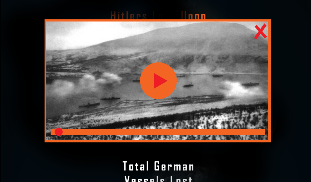
The interactivity on my application are a number of interactive buttons I based the design of the buttons on an old ww2 radio, when you click on the button a video pops up or a sound clip. My idea behind these interactive buttons was to make them look as though they are wreckage from the ships floating around to the side of the time line, the buttons locate next to certain subjects and allow the user to choose between reading about a subject or watching a video on it or listening to a sound clip.
My idea behind the roll overs that contain the video players and sound players, I used a black container for this i tried to recreate the look of oil spillage in the water, again it relates back to the wreckages of the ships, I used orange again for these video players and sound clips again to make them stand out from the background.
Time Scale
My idea behind the time scale was to re-create a guide line for a diver, this relates back to going down into the water as a diver to discover the ruins of the battle for yourself, on the time scale to tell the user what year they are in I used a red light at the top of each individual time scale, so the user can easily tell what year they are reading about, the red also stands out from the dark background.
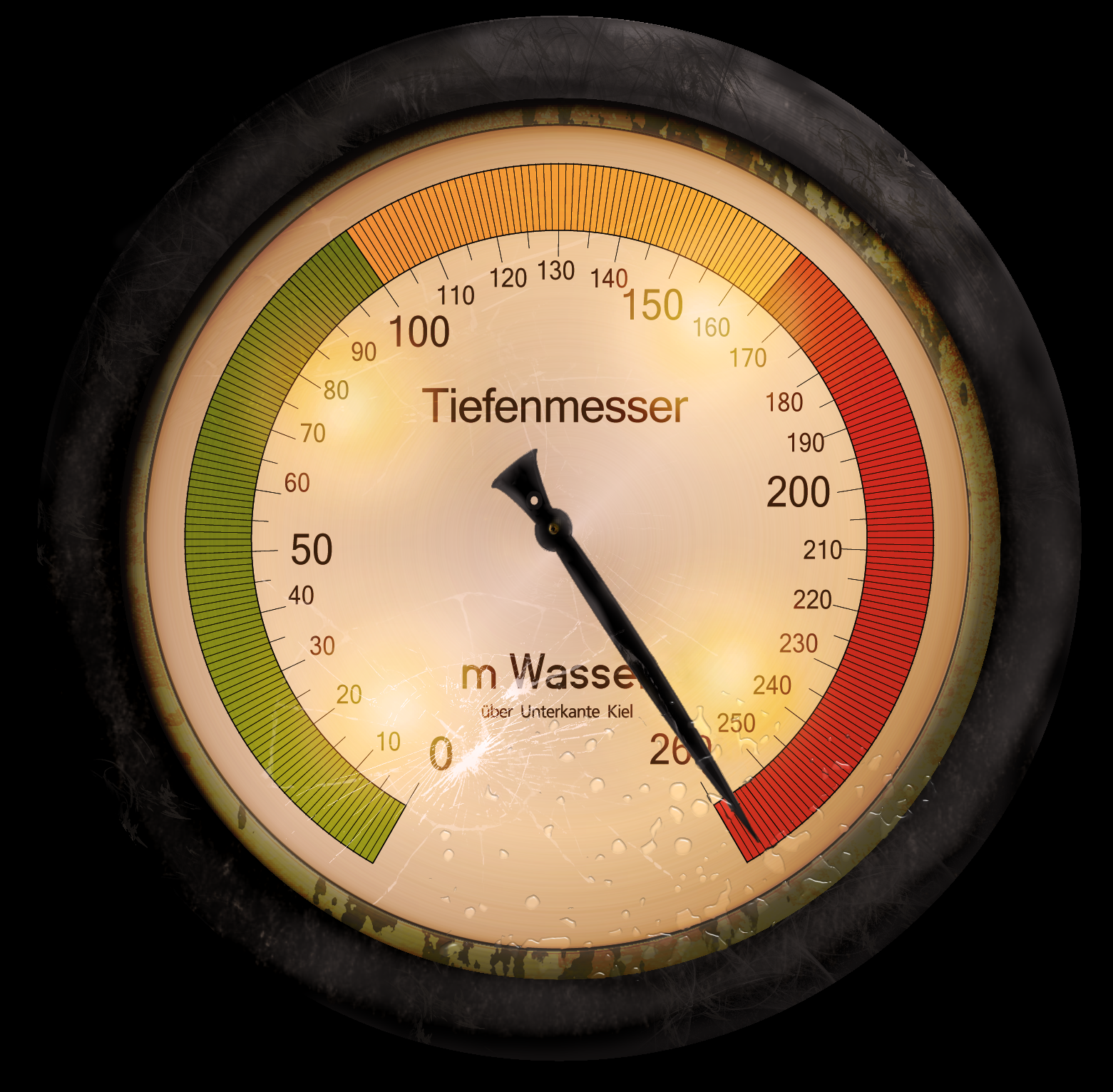
For my secondary time scale I themed it as a pressure gauge that would be used on a submarine, as you go down into the water the gauge pressures up its as though your going down in time. It creates that feel as though your going under water, I wanted it to create a level of immersiveness in my application.
Quotations
Breaking up my time scale are quotations from Winston Churchill and Hitler, the first quotation by Churchill sets the tone for the app, “The Battle Of The Atlantic Is The Only Thing That Ever Frightened Me”, it makes the app quite scary in a way my approach to this was to trying and make the user wonder what they are going to see under the waters of the Atlantic.