
One of the key learning curves for me, was to learn how to use a frame work and then develope a website using a frame work. Before delving into this section, I believe it is key that I explain exactly what a frame work is.
“A framework is a standardized set of concepts, practices and criteria for dealing with a common type of problem, which can be used as a reference to help us approach and resolve new problems of a similar nature.”
a frame work is a package of different files such as (html, css, javascript) this files create the foundations of a website, allowing a web designer to use them as a structure for there website.
The use of a frame work supports the development of a website, and cover different aspects that make a website, making it easier for your website to be:
- Respond to different device screen sizes
- Animations for buttons, and other areas
- Reusable code, and shortcuts
Resource: A WWW ARDS
Now that I had a great understanding of what a frame work does, it was now time for me to begin looking into different frame works, and then playing around with them to gain an understanding of how the code functions.

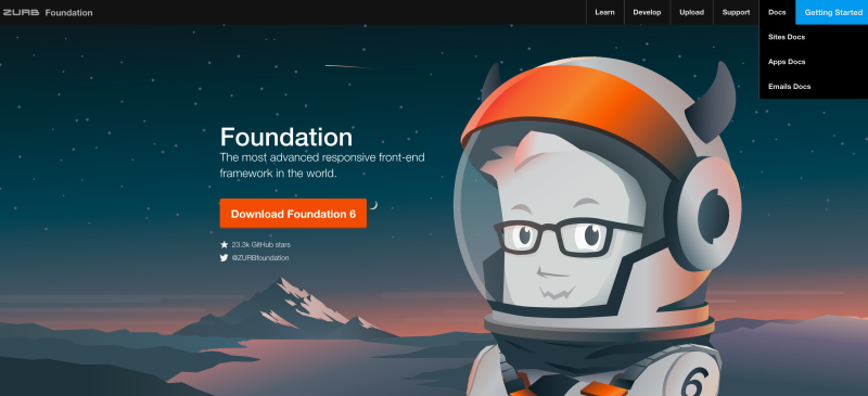
After looking through different frame works, I came to the conclusion that ‘Foundation Zurb’ is perfect for exactly what I want to do with this website. One of the first things I did before actually implementing a frame work into the website, I decided to have a little play around with the code, and watch some tutorial’s to develop an understanding of how to use this frame work. First of all I went onto the Foundation Zurb website, and downloaded the documents.
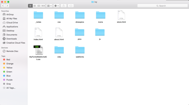
Once I had downloaded the documents, I had a look in the folder to see what files where contained inside.
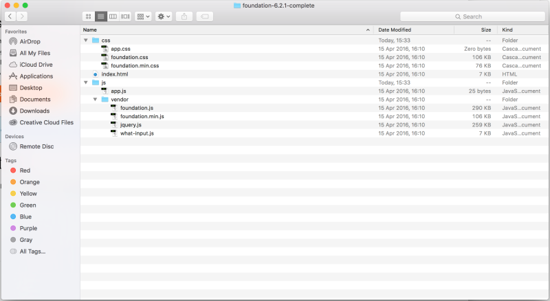
Within the folder are two different folders, and a file:
- CSS Folder
Containing the style sheets for the framework, including the ‘app.css’ which is the only style sheet that should be edited via the developer, this file allows the developer to over ride elements of the other two foundation style sheets.
- JS Folder
This folder includes all of the javascript, again with an ‘app.js’ file, allowing the developer to add further javascript to the framework.
- Index.html
This is the html file which is the website itself, and is connected to both the css files and the java script files.
(These files must be contained within your websites files tree)
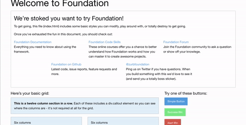
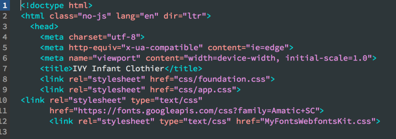
To Further inspect I opened up the html file in a browser to see exactly what all of these files together created.
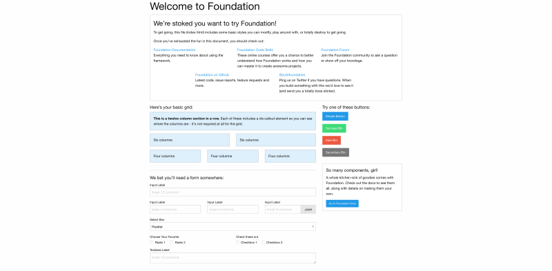
Here is what comes up when you open the file, giving an explanation of all of the different things you can achieve via using this frame work, such as the buttons and the creation of forms.
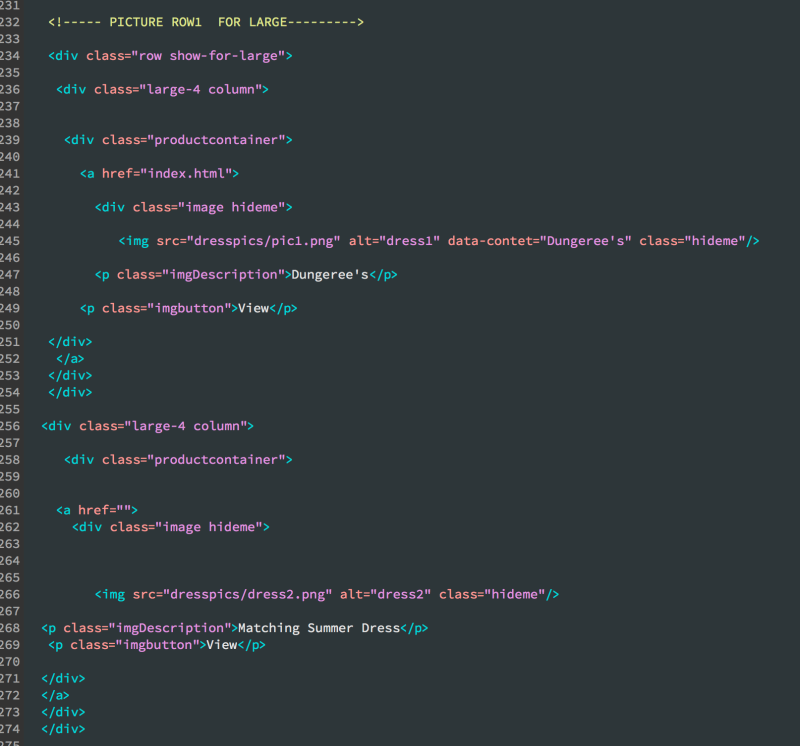
I then went onto opening up the file within dream weaver to have a closer look at the code, to see how this all works.
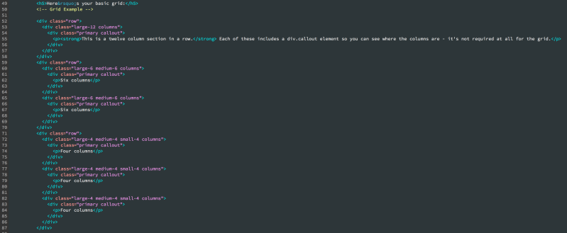
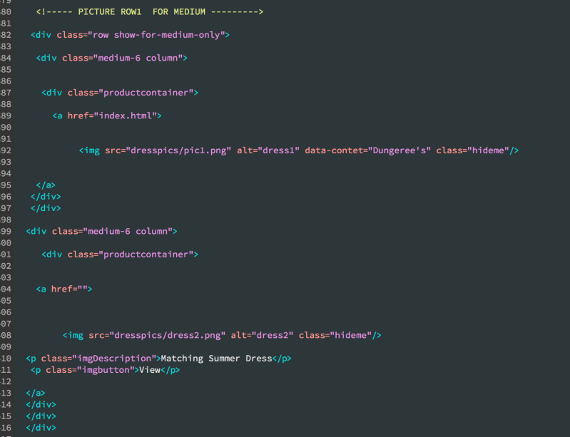
Within the actual file, you can see from this screen shot that each section of the website is built up of:
- Rows
The row is a div that goes horizontal across the website, and contains the columns.
- Columns
The column is a div that goes vertical on the website, keeping in mind only 12 columns are permitted to be used within a row. The content you want to enter into a row, goes within a column.
Here’s a closer look, of a column:
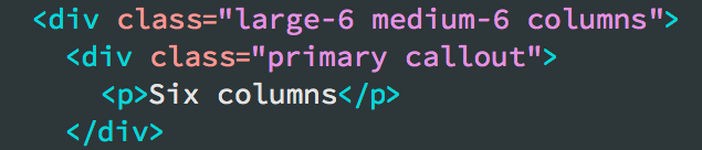
As you can see within each column, are attributes that set the size of the column:
- Large
for large screen such as desktop or laptop devices
- Medium
for tablet devices
- Small
for mobile devices such as smart phones
Setting the unit next to the size attribute such as “large-6” means that the content within that column will take up the room of 6 columns within that row. The reasoning behind using a grid system, is because it makes its easier for the developer when taking into consideration responsive design.
This means that the developer does not need to enter media queries for each element, to make them resize when the website is used on a device with a smaller screen size, instead it saves time and creates a more fluid development process using shortcuts.
Here is a gif I have captured that shows off the use of a foundation framework, in relation to the responsive design:


 aidan crow