As part of my research I looked into different Southern American fonts, to gain a greater understanding of the kind of fonts to use for mine and Alistair’s High Noon Holster re-design. From my research of the Southern American sites, I gained a good understand of the kind of fonts I need to be looking at, and saw a few that caught my interest.
Another thing I have noticed from my thematic Southern website research is that most of the fonts bared characteristic’s of old style Serif’s and Slab Serifs. The fonts i need for my titeling of the High Noon Holster re-design, need to be decorative and have quite a bold and old look to them, and maybe even have some form of decorative characteristic’s. I did a little research into Old Style Serifs and Slab Serifs, to gain a greater understand of the fonts I will be using.
Slab Serif Font
 The Slab Serif fonts also known as (Egyptian) fonts feature bold text similar to the Modern Serif. Both the vertical and the horizontal edges of these fonts are thick, and they also have horizontal serifs. Probably one of the most famous Slab Serif fonts in the font family would have to be “Clarendon”, this font is probably the best example of a Slab Serif. The Slab Serif is also easier to read in blocks of text, compared to the Modern Serif, you will find the Slab Serif in the modern being used in children’s books. Below is an example of the Slab Serif, and shows off the fonts characteristic’s that make the font what it is.
 History Of The Slab Serif
The Slab Serif first came about during the “Industrial Revolution” in the 9th century, when profound changes came to the printing and typography world. The mass production of print, allowed for the creation of more functional type designs for commercial purposes.
The need for type faces in advertising that where not only readable, but where bold and stood out from the page to catch the reader’s attention, was very important. The Slab Serif was an outstanding contribution to these needs, and was the most popular during this era of mass production, and is still very popular today.
The reason behind the Egyptian sounding names of some of the Slab Serif fonts like the fonts “Cairo” and “Karnak” was down to fact during the time the public had a fascination with the discoveries of ancient Egyptian artefacts, and is something the public would be have been reading about during the “Industrial Revolution”. By the end of the 19th century there was loads of different variations of the Slab Serif font, and typography had become very popular and the public took great interests in the world of type.
The Slab Serif relates more to western wanted posters, but this falls into the use of weapons and old America which I think would be very fitting of the High Noon Holsters re-design. Below is a picture of a wanted poster that gives example of the use of the Slab Serif font.

Old Style Serif
 History Of The Old Style Serif
The differentiation between the size of the stokes on this style of type face is the biggest tell-tale sign of an Old Style Serif as though it has been hand painted like the Romans used too. Also the Serifs at the end of the letters are slanted, here is an image of old an old style serif with the characteristics of the font explained.

During the 15th to the 17th century type was used on manu-scripts, and during this period saw the creation of 300 different type faces, these are refered to as Old Style Serifs. When printing came to Italy, the type design used was more rounded roman letter style was more readable in comparison to the Gothic font which was more widely used previously.
Venice became one of the most important places for the design of type, mainly down to the location during the 15th century. Francesco Griffo an Italian typographer, created one of the most important type faces in history for a manuscript written by Cardinal Pietro Bembo in 1949. The type face was called “Bembo” after the author the manuscript. The popularity of the font Bembo spread throughout Europe, and this type design became the most inspirational design for later type designs for the next one hundred and fifty years, the designs we refer to as Old Style in the modern-day, can be traced back to Bembo.
The Bembo type face would slowly be perfected over the hundred and fifty years by other typographers into fonts that still carried the same characteristic but would be slightly changed so the font could be used for other purposes. These other type faces would be “Garamond” type face, during the 16th century, the “Caslon” type face during the 18th century.
Southern Fonts
Titeling
For the titeling on the High Noon Holsters re-design, I want to incorporate a few different fonts just like the other Southern American fonts I looked out, to give it that rugged, D.I.Y look to it. I looked at a variety of Old Style Serifs, Slab Serifs, and even some Script fonts I could maybe incorporate together to give it that rugged look.
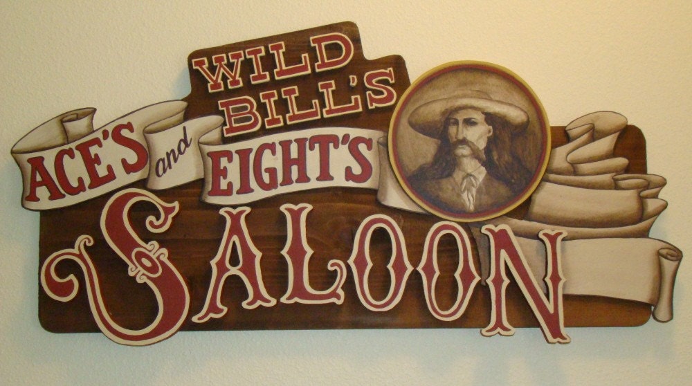
This style can also be seen on the front of Saloons in Southern America, I think this is where the whole design of this formation of tilling has come from, below is a picture of the sign of a Saloon that shows this off.
 Some Southern American fonts can be quite decorative and during my research I saw some great examples of decorative fonts. One of my favourite fonts I came across during my thematic Southern American sites research was on the Old El Paso site for the company logo, picture below.
 I tried to find this font using font finder but the search did not find a font that even bared resemblance to this one, but I found another site called “TravelTex” which had another font that had at the end of the lettering that reminded me of the handle of a gun. So I used font finder to locate this font, that looks like this…
 I came across a few fonts that bared resemblance to this one, which I think could be very fitting for the tiling on the High Noon Holster re-design. Below are a few fonts I came across that I think would fit right in on the re-design.
FTY Garnish Worse Regular

This font looks as though it should be on the front of a wanted poster.
Bonzer – San Francisco

This font reminds me of the kind of type face you find on the front of a saloon in the old west, its stylish and bold and would fit into the re-design of High Noon Holsters.
I also looked at some script type faces, and decorative type faces.
Texas
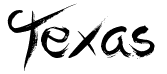
This font is script and decorative, it looks hand written and I think it would fit in with the whole D.I.Y. look to the tiling, probably would work really well on the bottom of the titles.
Carnivalee Freakshow Regular
Decorative and holds characteristics of a slab serif font, this is another font I think looks as though it could maybe be used on the front of a saloon or on a wanted poster.
Main Body Text
For the main body I think it would be fitting to use a form of basic Old Style Font, considering it was one of the original type faces to be used on manuscripts and used in the first small hand-held books, I think it would give the page quite an old and authentic look to it.
Horley Old Style

An old style serif like this would be great for the main body text, something simple easy to read, but at the same time keeps that old look to it. When it comes to the actual design I will be looking through and testing a few other old style fonts, for the main body text.


 Even the American flag and the Southern American flag use these bright reds and blues, alongside the patriotic white stars. These colours together are very American, the white represents purity and innocence, the red signifies hardiness and valour, and the blue represents the colour of the chief.
 As you can see from the picture below, colours of the deserts of Southern and Western America are bright oranges and reds, accompanied by the bright blue sunny skies. And these colours are emphasized across the designs of spaghetti western posters, to set the mood of the boiling hot red, orange, and blue deserts where the movies are based.
 Another colour range that comes to mind when I think of old western and southern america, are browns, and blacks. This is because I think of the old wooden saloons, and ghost towns. I love the idea of the re-design having some really intense reds, oranges, and blues on the top of the page, but then as you scroll down onto the main body of the page it moves onto some darker tones of colour where the content of the site will be located.
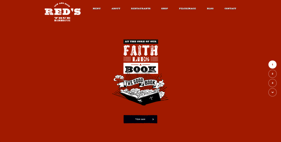
 The bright yellows, reds, and oranges are used on the Thematic Southern American sites I looked at such as Old El Paso, and the Rango sites, they showed off some really intense shades of oranges yellows and blues. The Red’s True Barbecue website had a mixture of these bright colours, and then moves onto some darker shades as you scrolled down the page.


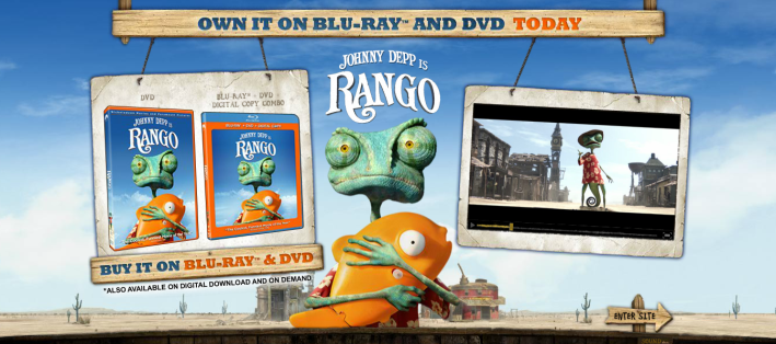 Out of the three websites, this is the only one that breaches the boundaries between a website and an online interactive story book. It is visually immersive and keeps the user entertained as they travel through the pages, like the Red’s website the Rango site uses a unique form of story telling for the user, the interactivity on this page is quite childish and fun and sits the user in the world of Rango and allows you to explore through the different worlds Rango encounters in the movie.
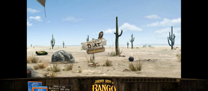 As you can see once you click on the sign located on the top image, it takes you too another area of the website, it’s quite an interesting way to navigate around the site, and for I would say it is quite a clever way to keep the younger audience interested in the website. Each page is themed like a scene from the movie, and creates that affect for the user as though its them exploring the world of Rango for them selves.
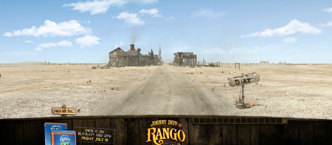 Another cool little thing about the page is that you can interact with characters you see in this world, and play games with them and so on. Like this page, after you enter into the “General Store” you can then, buy the film from the shelf below is the picture of the general store.


 The end of each letter in this font reminds me of the handle of a gun, which I think would be quite fitting for the redesign me and Alistair will be making. I used font finder to try and find the font but their was no match, but for the High Noon Holsters main title font I would like to use a font that is similar.